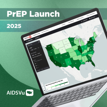
Enhanced map interface from Darkhorse Analytics will provide a more user-friendly interface, updated maps, and easy navigation.
Today, AIDSVu has released an enhanced map interface to provide users with a streamlined user experience and better visualize public health data.
New features include:
- Guided tutorial for new and returning users
- Modernized navigation to ensure users can find the exact maps they need
- Updated maps with consistent cutpoints
- Streamlined export tool for easy downloading and sharing of specific map views
- New “compare mode” tool that allows users to compare any two maps
“Public health decision-makers need reliable and consistent data to help them determine where they are making progress and where there are gaps that require additional attention, services, and resources,” said Patrick Sullivan, DVM, PhD, Professor of Epidemiology at Emory University’s Rollins School of Public Health and Principal Scientist for AIDSVu. “AIDSVu and HepVu’s joint mission is to make data widely available, easily accessible, and locally relevant to increase awareness and inform public health decision making. This updated interface makes these data even more widely available and easily accessible.”
Check out our Vu Tutorial


