The following guest post comes to us from Barb Cardell of the Colorado Coalition for HIV Care and Prevention, and Board Chair of the Positives Women Network, who frequently uses AIDSVu in her work and recently spoke at the 18th Annual United States Conference on AIDS about the impact of visualizing complex data.
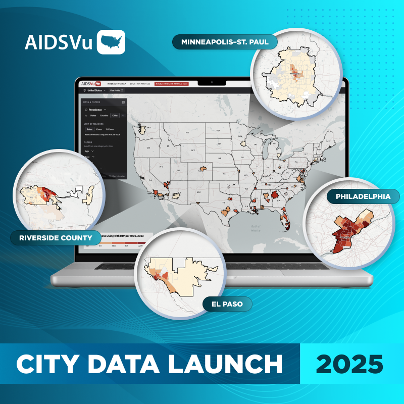
A really good data set answers questions we didn’t know we had and helps to generate a conversation about advocacy. By mapping and visualizing complex data, we can broaden our understanding of the information and see patterns in the data that might otherwise escape our attention. In the case of AIDSVu, mapping and visualization of dense HIV data gives us a new perspective of the epidemic. Here’s how:
- Mapping helps us to see trends that were not as evident in the past with the charts and numbers of surveillance reports. For example, when we looked at the AIDSVu map of women living with HIV in Colorado, a new trend was evident that was not easily identified before: women who contracted HIV from a heterosexual partner are strongly centralized in our larger cities.
- Visualizing complex data empowers people to go beyond their personal stories living with HIV and speak to the larger epidemic. They can then stand up for others, and amplify the impact beyond themselves. I find that sometimes statistics can be overwhelming, sound negative and be silencing to could-be advocates. Visualization helps remove the fear of inaccessible rows of columns and numbers in favor of something manageable.
I visited Washington, D.C., earlier this year with AIDSWatch for the largest constituent advocacy event for people living with HIV – hosted by AIDS United, TAEP and The USPLHIV Caucus – to meet with elected officials and educate them about HIV and AIDS. In preparation for these meetings, I knew that I needed to shape and tailor my message to specific elected officials, while keeping in mind that not everyone understands data tables, and not all elected officials are aware of HIV realities in their districts. Successful advocacy requires you to paint a clear understanding of your messages and in this case, I used AIDSVu maps to support my points.
The AIDSVu maps helped me to easily explain to our elected officials: There is a large number of people in your state who are living with HIV; they are in need, and you need to help them.


